Chapter 5 Key to Lab 1: Data vis, wrangling, and programming
You can find the repo for this lab here
As we have done previously, go to Code, download zip and put folder on your computer. Open the project in that folder and then open the .Rmd. Remember that opening the project from that folder will set that folder as the “working directory”. Doing so means that when you read in your data, R will “look” in the right place to find it. Remember to rename the .Rmd file with your name in the file name.
This lab covers workflow and functions that you have seen and a few things that haven’t been explicitly demonstrated. Using functions that haven’t been explicitly demonstrated will help you in developing your ability to use new functions and workflows. Understanding how to utilize resources like Stack Overflow and package vignettes will help you solve coding problems. You can also get function and package help from the console by typing “?”. For example, you could type “?ggplot” or “?tidyverse” into the console and a help window will appear in the lower right. Also, when you are searching for coding help it is useful to be explicit about whether you are in base R or tidyverse.
5.1 Problem 1 (5 pts)
Load the tidyverse library.
library(tidyverse)Read in the pine_nfdr csv using read_csv(). Name this “pine_nfdr”.
pine_nfdr <- read_csv("pine_nfdr.csv")Make a plot with the date on the x axis, discharge on the y axis. Show the discharge of the two watersheds as a line, coloring by watershed (StationID). Use a theme to remove the grey background. Label the axes appropriately with labels and units. Bonus: change the title of the legend to “Gauging Station”
pine_nfdr %>%
  ggplot(aes(x = datetime, y = cfs, color = StationID)) +
  geom_line() +
  theme_linedraw() +
  labs(x = "Date", y = "Flow (cfs)", color = "Gauging Station", caption = "Figure1. This is a caption") +
  theme(plot.caption = element_text(hjust = -0.15, size = 16))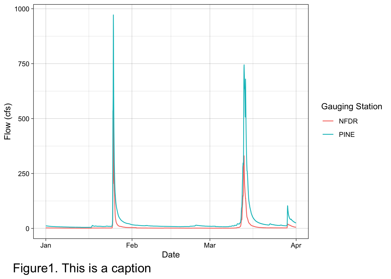
5.2 Problem 2 (5 pts)
Make a boxplot to compare the discharge of Pine to NFDR for February 2010.
Hint: use the pipe operator and the filter() function.
pine_nfdr %>%
  filter(month == 2) %>%
  ggplot(aes(x = StationID, y = cfs)) +
  geom_boxplot()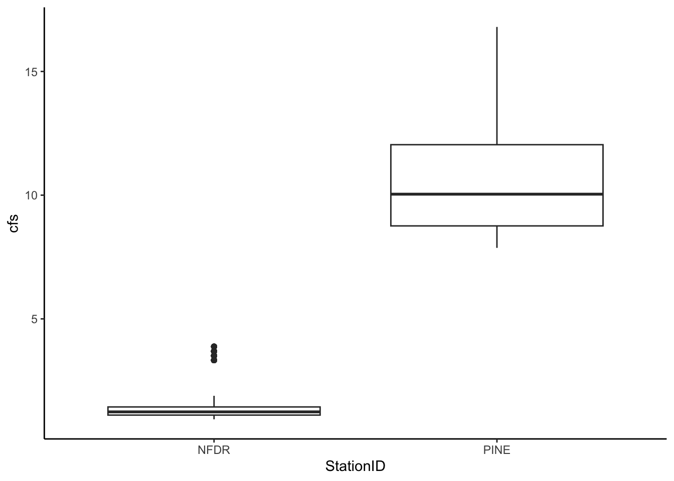
5.3 Problem 3 (5 pts)
Read in the flashy csv. Name this “flashy”.
flashy <- read_csv("flashy.csv")Create a new df called flashy_west that includes data for: MT, ID, WY, UT, CO, NV, AZ, and NM
west <- c("MT", "ID", "WY", "UT", "CO", "NV", "AZ", "NM")

flashy_west <- flashy %>%
  filter(STATE %in% west)
Using flashy_west: Plot PET (Potential Evapotranspiration) on the X axis and RBI (flashiness index) on the Y axis. Color the points based on what state they are in. Use the linedraw ggplot theme.
flashy_west %>%
  ggplot(aes(x = PET, y = RBI, color = STATE)) +
  geom_point() +
  labs(x = "PET (mm)", y = "RBI (-)", color = "State")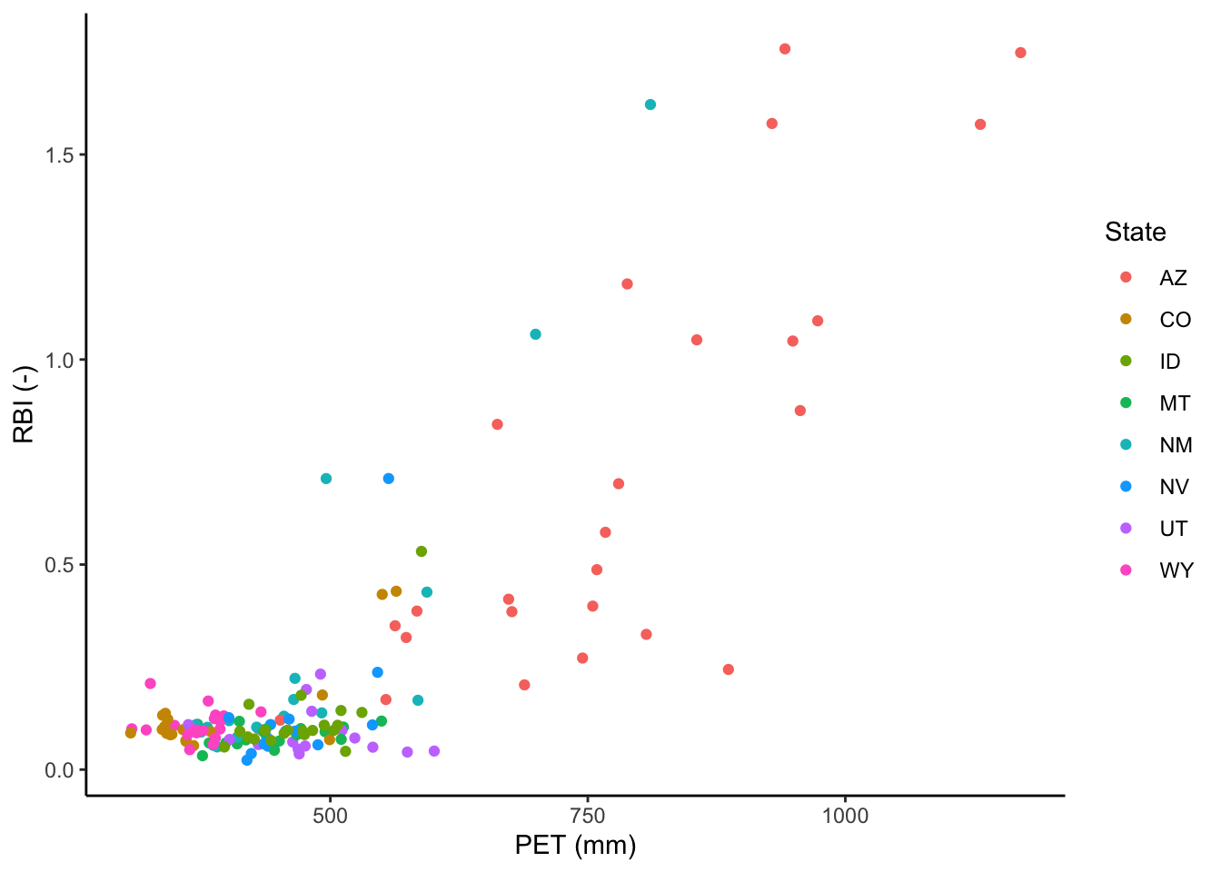
Using flashy_west make a facet wrap with PET on the x and RBI on the y. Facet by state.
flashy_west %>%
  ggplot(aes(x = PET, y = RBI)) +
  geom_point() +
  facet_wrap(facets = "STATE")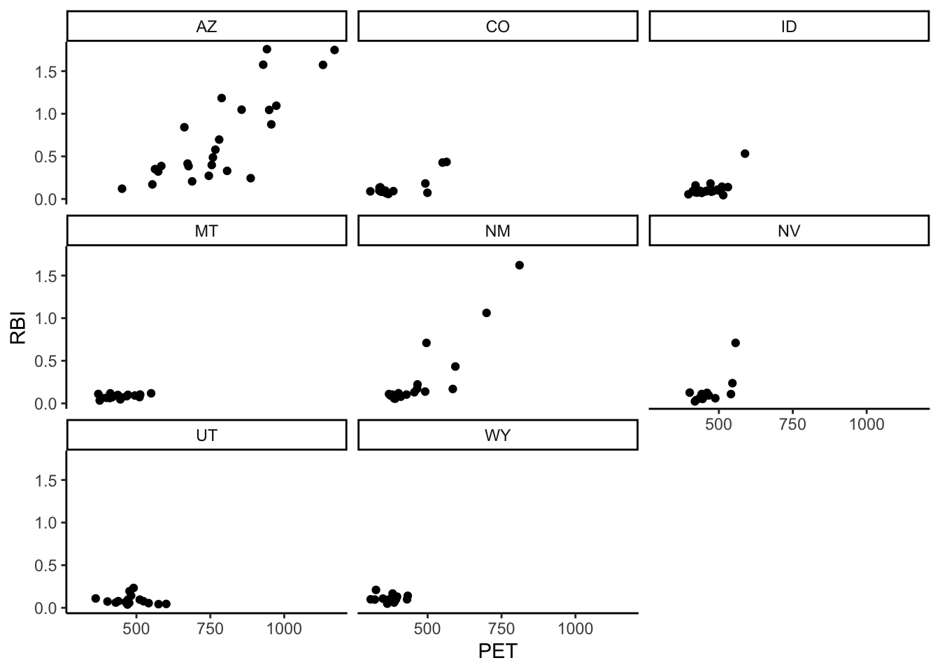
5.4 Problem 4 (5 pts)
We want to look at the amount of snow for each site in the flashy_west df. Problem is, we are only given the average amount of total precip (PPTAVG_BASIN) and the percentage of snow (SNOW_PCT_PRECIP).
Create a new column in the df called “snow_avg_basin” and make it equal to the average total precip times the percentage of snow (careful with the percentage number).
flashy_west <- flashy_west %>%
  mutate(snow_avg_basin = PPTAVG_BASIN * (SNOW_PCT_PRECIP/100))
Make a barplot showing the amount of snow for each site in MT. Put station name on the x axis and snow amount on the y. You have to add something to geom_bar() to use it for a 2 variable plot. Use “?geom_bar” in the console and the internet to investigate.
flashy_west %>%
  filter(STATE == "MT") %>%
  ggplot(aes(x = STANAME, y = snow_avg_basin)) +
  geom_bar(stat = "identity") +
  theme(axis.text.x = element_text(angle = 90, vjust = 0.5, hjust=1))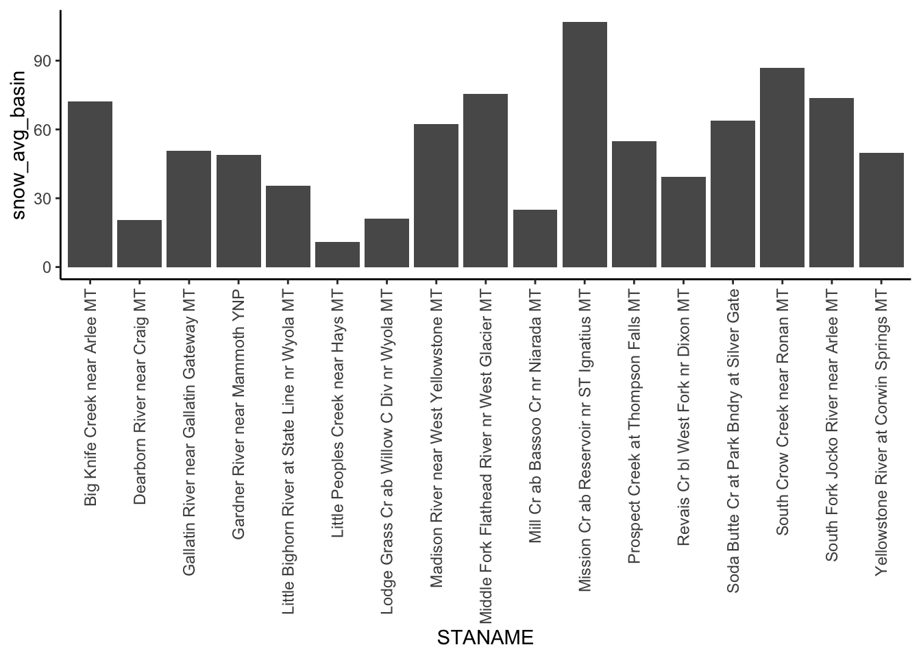
The x axis of the resulting plot looks terrible! Rotate the X axis labels so we can read them.
# See above. 5.5 Problem 5 (5 pts)
Create a new tibble called “flashy_west_sum” that contains the min, max, and mean PET for each state in flashy_west. Sort/arrange the tibble by mean PET from high to low. Give your columns meaningful names within the summarize function or using rename(). You haven’t seen rename yet. Use ?rename in the console or search for examples. When searching you need to indicate that you are looking for “tidyverse rename”. Rename is part of dplyr, which is part of tidyverse.
flashy_west_sum <- flashy_west %>%
  group_by(STATE) %>%
  summarize(min_pet = min(PET), max_pet = max(PET), mean_pet = mean(PET)) %>%
  rename(State = STATE) %>%
  arrange(desc(mean_pet))
Create a barplot from flashy_west_sum with max_pet on the y and state on the x.
flashy_west_sum %>%
  ggplot(aes(x = State, y = max_pet)) +
  geom_col()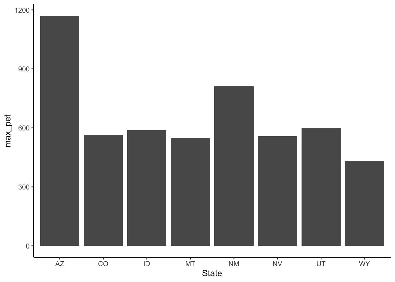
# or

flashy_west_sum %>%
  ggplot(aes(x = State, y = max_pet)) +
  geom_bar(stat = "identity")
5.6 Problem 6 (5 pts)
Take the tibble from problem 5 and create a new df “flashy_west_new” by first creating a new column that is the Range of the PET (max PET - min PET). Then get rid of the max PET and min PET columns so the tibble just has columns for State, mean_PET, and PET_range.
flashy_west_new <- flashy_west_sum %>%
  mutate(range_pet = max_pet - min_pet) %>%
  select(State, mean_pet, range_pet)

# or

flashy_west_new <- flashy_west_sum %>%
  mutate(range_pet = max_pet - min_pet) %>%
  select(-min_pet, -max_pet)
Using flashy_west_new make an interactive ggplotly with mean_pet on the x and range_pet on the y. Color by state and label axes.
#install.packages("plotly")

library(plotly)

ggplotly(
  flashy_west_new %>%
    ggplot(aes(x = mean_pet, y = range_pet, color = State)) +
    geom_point()
)
Save flashy_west_new as .csv files to your folder for this lab using the write_csv function. To get help on this function type “?write_csv” into the console.
write_csv(flashy_west_new, "test_df.csv")5.7 Summary (5 pts)
Using the figues from problems 5 & 6 comment on the pattern in max PET across the western states. What climatological variable is likely driving this pattern? Do you think the values of actual evapotranspiration (AET) would be the same or different from the values of potential evapotranspiration (PET)? In which state would AET and PET potentially be most different and why?
PET is the amount of water that could be transpired given water is not limiting. So in AZ where there is very high net radiation and low humidity the PET will be exceptionally high. Conversely, AET (the actual ET) in AZ will be limited by available water. The balance between PET and AET is often conceptualized in terms of water vs. energy limitations. Hot-dry places like AZ are water limited, whereas cold-wet places are generally energy limited in terms of constraints on AET. As such, the difference between PET and AET is often most different in hot-dry places (e.g., AZ).
This can be demonstrated even more clearly with the following where we plot PET vs P and color by State and size by mean temperature.
flashy_west_sum <- flashy_west %>%
  group_by(STATE) %>%
  summarize(min_pet = min(PET), max_pet = max(PET), mean_pet = mean(PET),
            mean_ppt = mean(PPTAVG_BASIN), mean_T = mean(T_AVG_BASIN)) %>%
  rename(State = STATE)

ggplotly(
  flashy_west_sum %>%
  ggplot(aes(x = mean_ppt, y = mean_pet, color = State, size = mean_T)) +
  geom_point() +
  labs(x = "Mean P (mm)", y = "Mean PET (mm)", size = "Avg T")
)
PET Reading:
Vargas Zepetello et al. 2019b read Abstract and Introduction sections